The Task
The task for this project was to design and develop a solution to promote a singular product using original content on a webpage.
The task for this project was to design and develop a solution to promote a singular product using original content on a webpage.
The requirements of this project were straight forward, below is a list of them.
The process for this project loosely followed the guidance of the UK Design Council Double Diamond for the design, following the principles set out of diverging and converging actions, which allowed the project and both the system and user requirements could be met.

The primary type of research undertaken for this project was competitor analysis, this was conducted on two of the biggest candle brands on the market to see what their current websites were like the information they provided and how it was presented. Having done this, I found that competitor offerings felt very flat and dull, almost like there was no focus on page design at all. Considering selling candles is all based on smell, it felt like the page for this task needed more colour and detail to help portray that sense of smell through a webpage. This research also gave me a great deal of the important information that should be provided to inform the user but not overwhelm them.
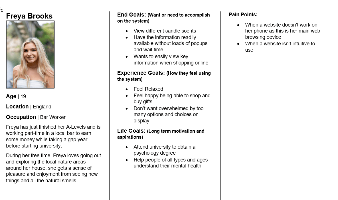
The define stage allowed the requirements list to be finalised with some of the key user requirements discovered from competitor websites. As well as creating personas for what at this point, is the expected typical user. This image shows one of this made for a younger adult who enjoys many of the natural things in life. This user would typically be using the site to purchase a gift for others, or in some cases for themselves.
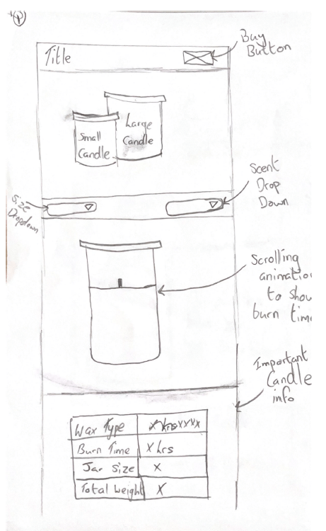
Wireframes were produced to run the five-second tests, this was done to gain some user feedback on some layout concepts before high-fidelity mock-ups were produced, as this was a small-scale project, multiple wireframes could be produced quickly, without needing to worry about them being perfectly drawn. Below shows one of the wireframes produced. Due to the user testing that was being done with these, the wireframes were more detailed than I would normally produce, to ensure the user knew what they were looking at.
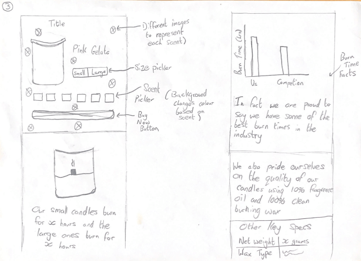
The user testing was conducted consisting of a five-second test, that was done to gain some user feedback on some layout concepts before high-fidelity mock-ups were produced. While this type of test is normally done with a high-fidelity mockup, I decided to do this with the wireframes, purely because I wanted layout feedback and didn't want the content to create any bias for users.
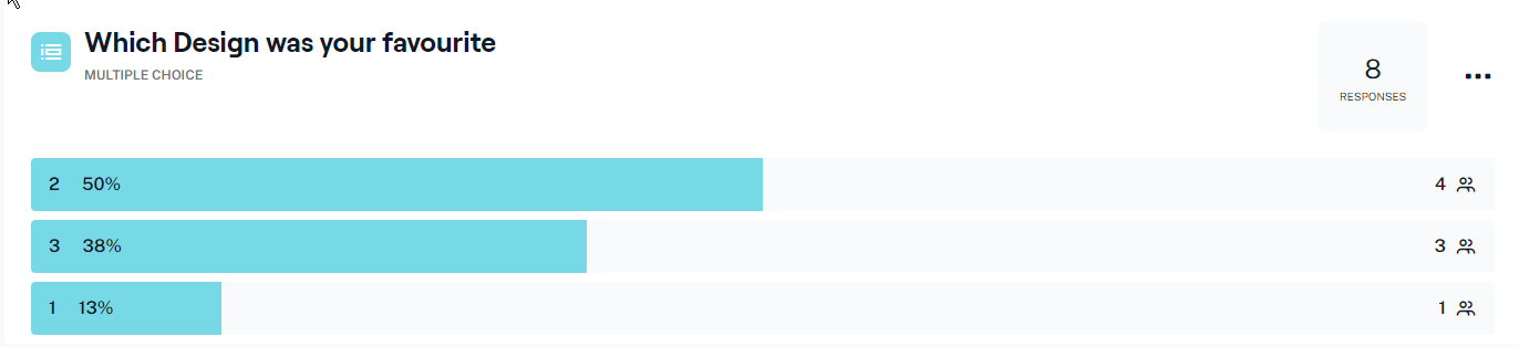
Each user was shown three wireframes for five seconds and asked to rate each one from 1-5 on a Likert scale in between. At the end, they were then asked to pick their favourite layout. The layout with the most votes would then be developed and using the Likert scale, some of the features from other layouts could be brought over to make one "complete" design.
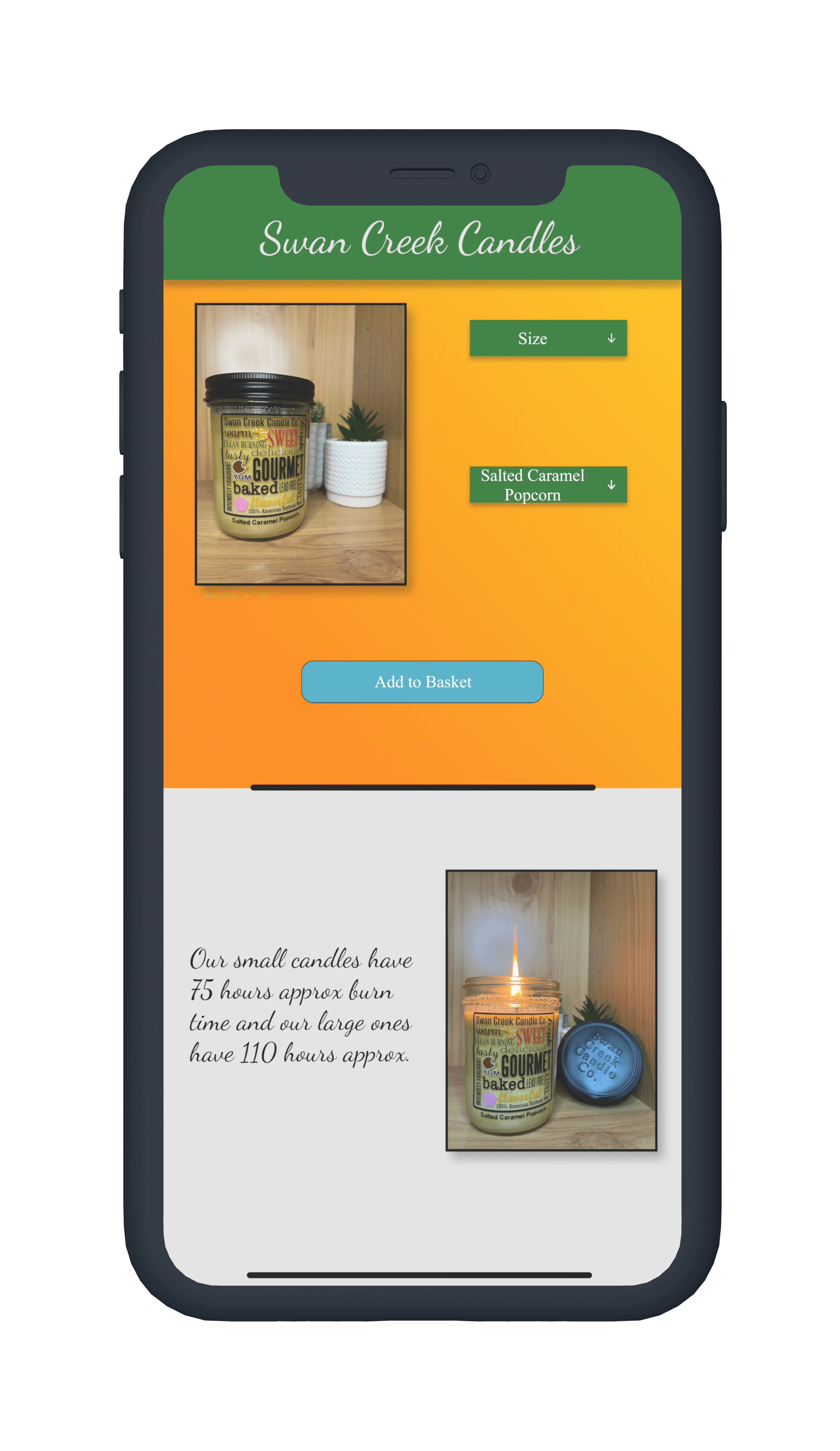
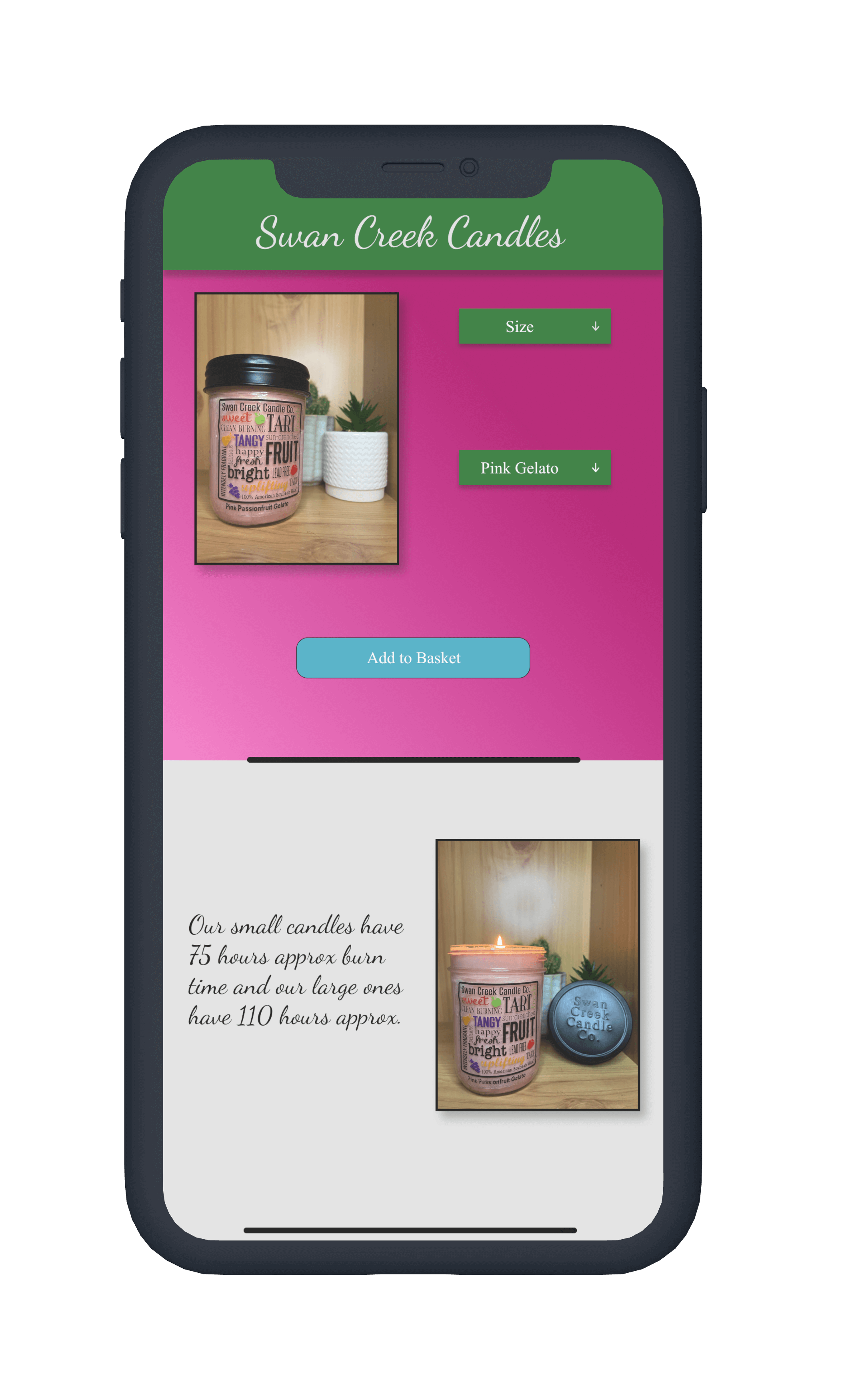
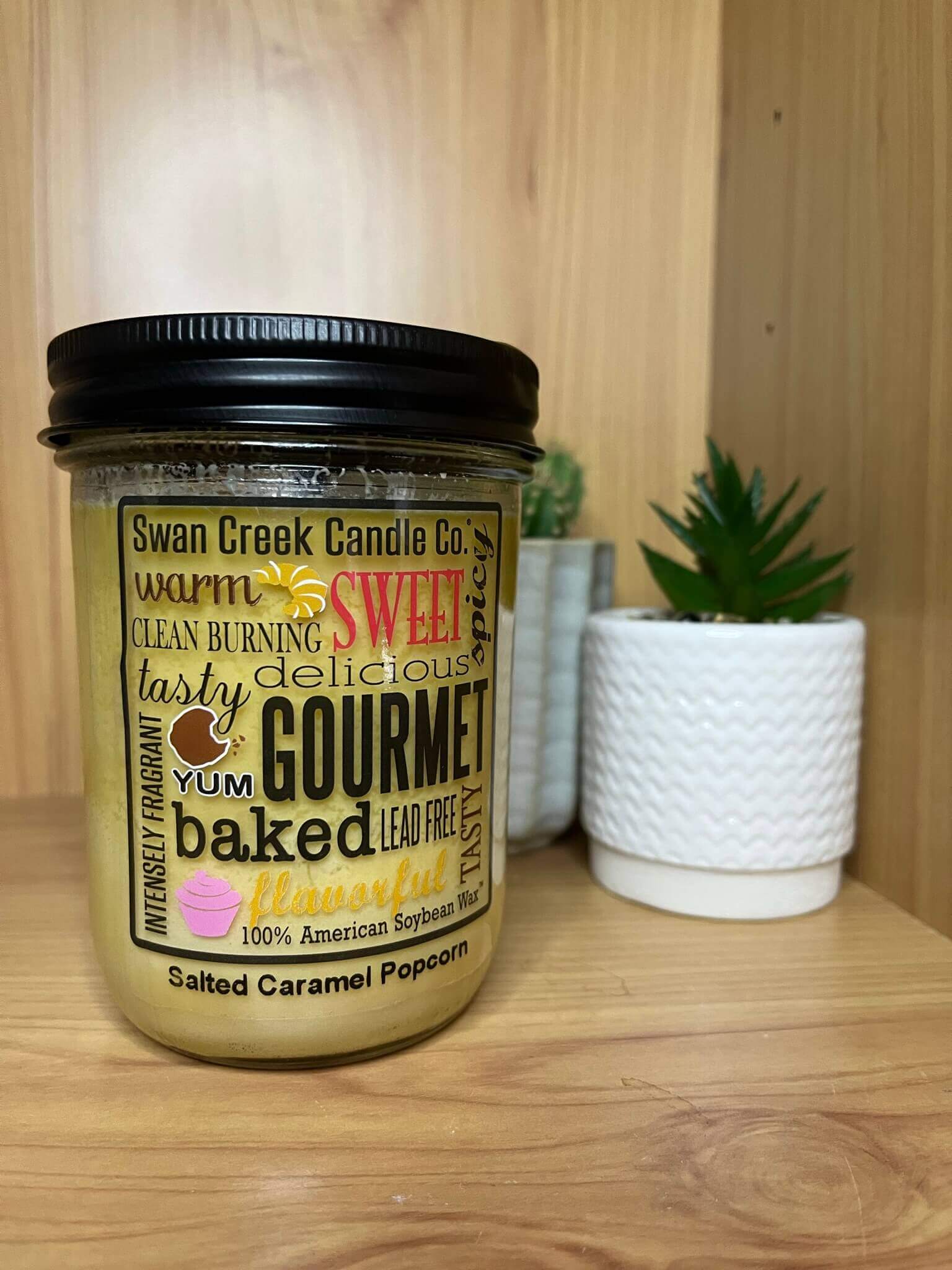
One of the key requirements for this project was to use original content, this meant taking the photos to myself in a way that best represented the product. The initial plan was to carry out a solo product shoot on clear white backing to remove anything that wasn’t the product, however, after perusing this path, without the proper setup for it, the idea just wasn’t working and the photos were looking subpar. With this, the direction changed to include other items/backing that would help promote the features of the candle, the photo shown shows the candle and a nice healthy green plant, in a wooden case to promote the use of natural wax in the candles.
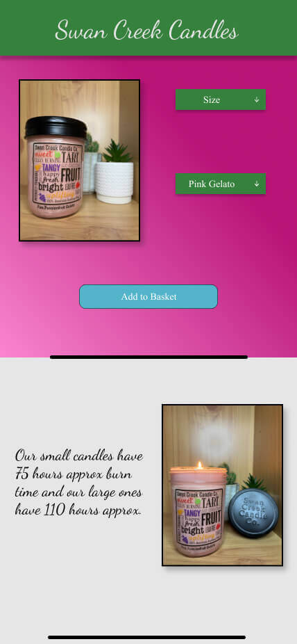
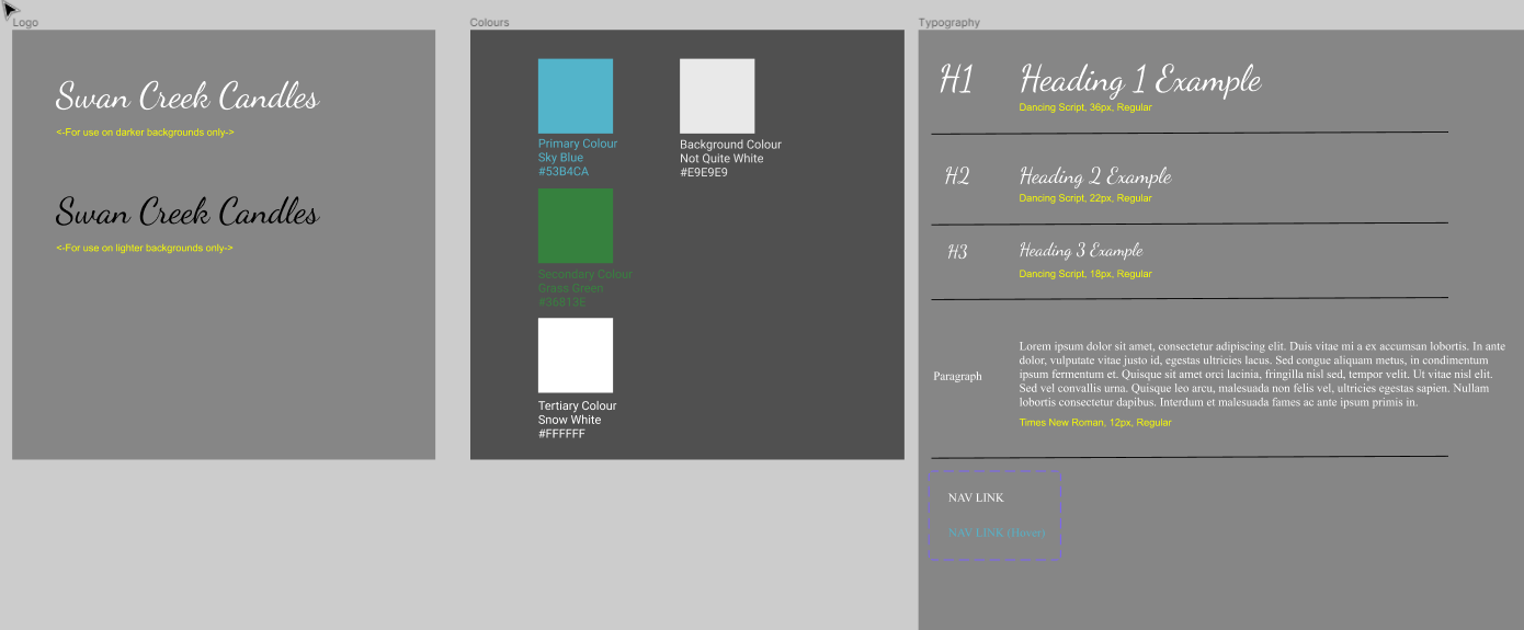
Another key requirement was to have the website supported across devices and having already produced wireframes in a mobile format for initial research, the design phase could move straight into high-fidelity mockup making, this started with producing a style guide to follow, showcasing key colours & fonts, then following into mocking up the mobile versions and expanding them into the desktop versions. The current website that sells this candle doesn’t have much in terms of feel or brand so near complete freedom was taken with this.
The HTML for the build was completed using current HTML5 standards and has been coded in a semantic way to allow for optimal accessibility and code readability throughout, this is key as users could be accessing the website with an accessibility device such as a screen reader, which heavily relies on code be written correctly. All of the images also include "alt" tags to ensure they can be correctly received by any user.
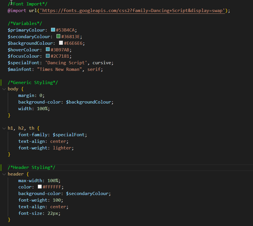
The CSS here isn't pure CSS, it's SCSS, doing this allows a very similar syntax of vanilla CSS to be followed, mainly in this code base I took advantage of the variables to create shorter lines of code, smaller files and faster loading times, all resulting in a better user experience, without compromising design.
While there were no requirements for Javascript to be used in this project, using it was inevitable to get the design to function the way it was intended, with the images & background gradient changing based on the candle scent you had picked, this was done simply using a few id selectors and changing the HTML img source based on the selected scent using ID's.
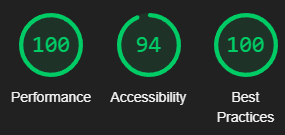
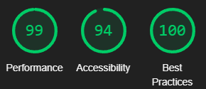
Performance testing resulted in a score of 98 on mobile and 100 on desktop with the main issues regarding image sizing, a noted issue was serving images in next generation formats such as webP, this is a solution that could be easily implemented benefits of this include support for transparency and animation in a single file type as well as reducing file size by around 30% more than jpeg without losing file quality. Key metrics including cumulative layout shift all passed with a good margin too.
Accessibility testing showed a score of 94 on mobile and desktop, the only accessibility issue highlight was he statement banner across the top having insufficient background/foreground colour contrast ratios. While this shows as an issue now, on a production version of this site, this banner would not be there to cause an issue. Lighthouse tests for common accessibility features such as alt tags on images and these have all been passed.
With the various types of testing completed, it is safe to conclude this solution can be succcesful in all of the requirements set out, from creating/using original content to ensuring the site worked across various devices. The extra performance testing showcased how the current standards have been followed and how accessibility has been built into the core of the project, ensuring access for all.