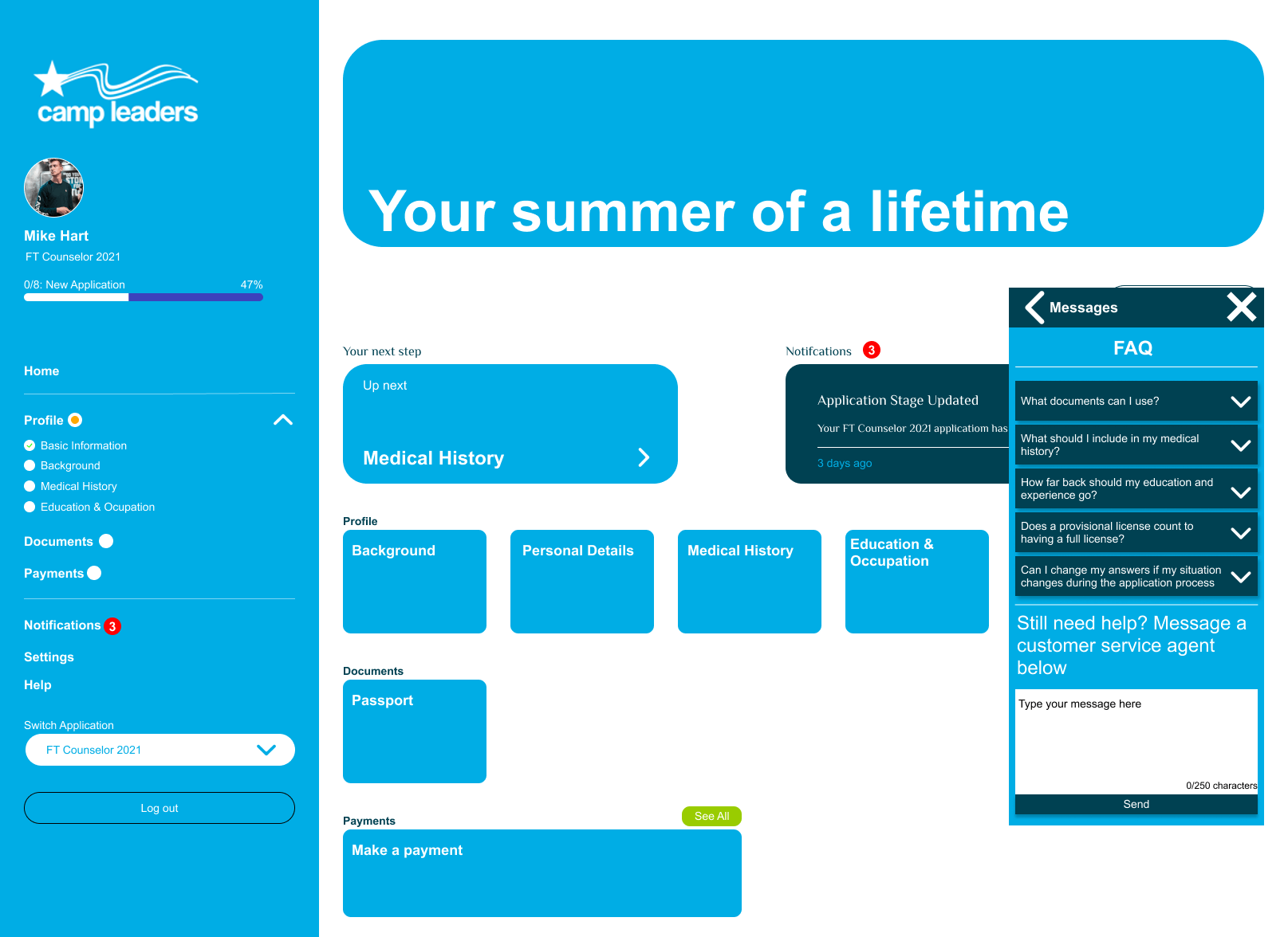
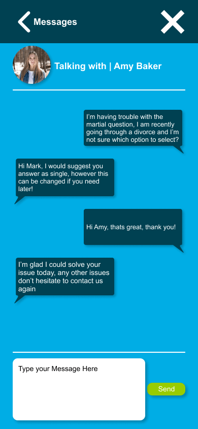
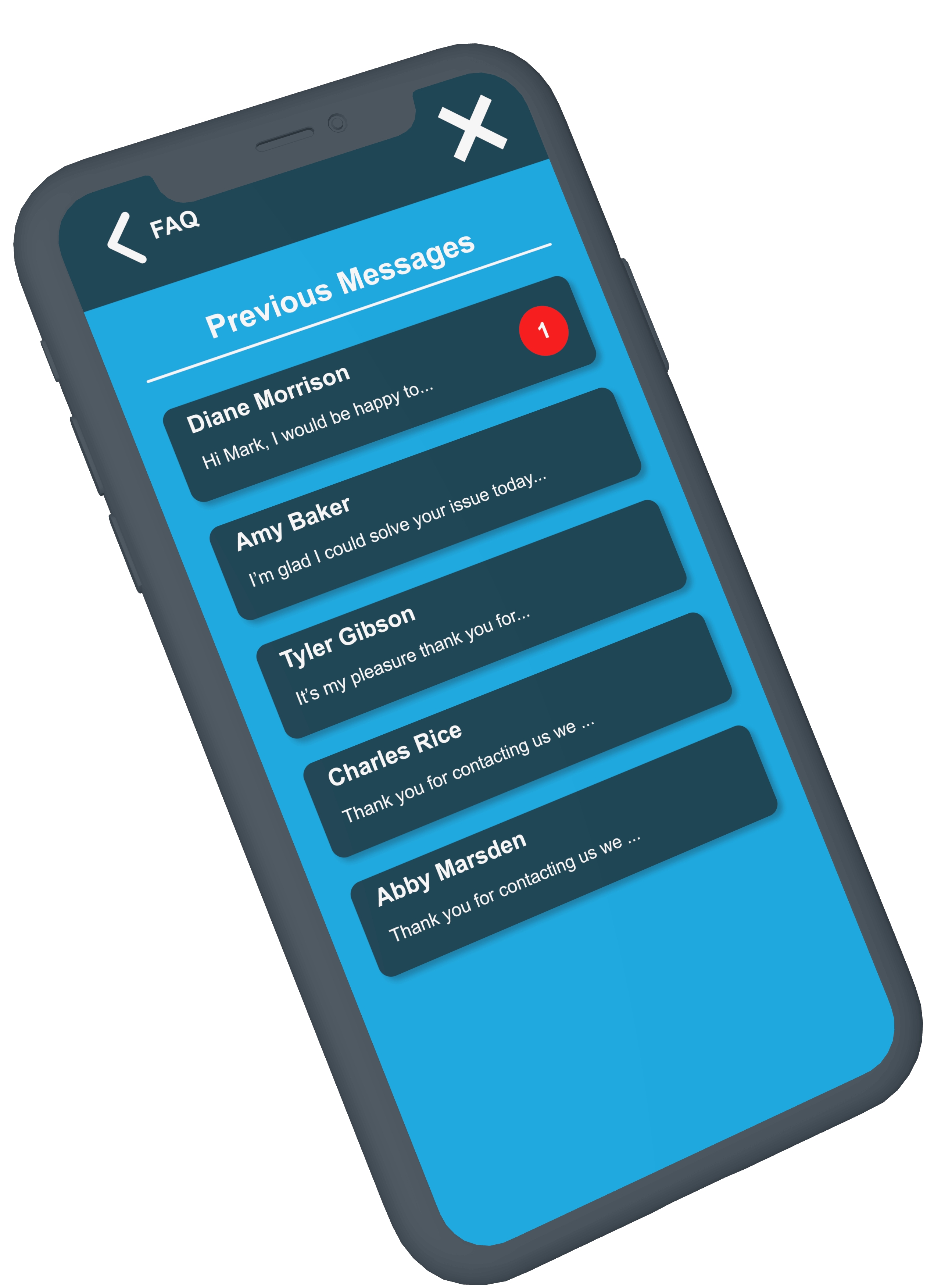
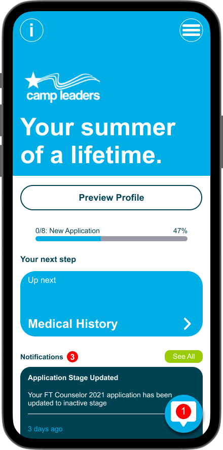
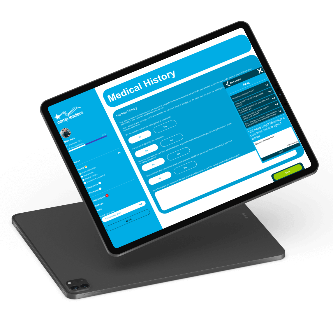
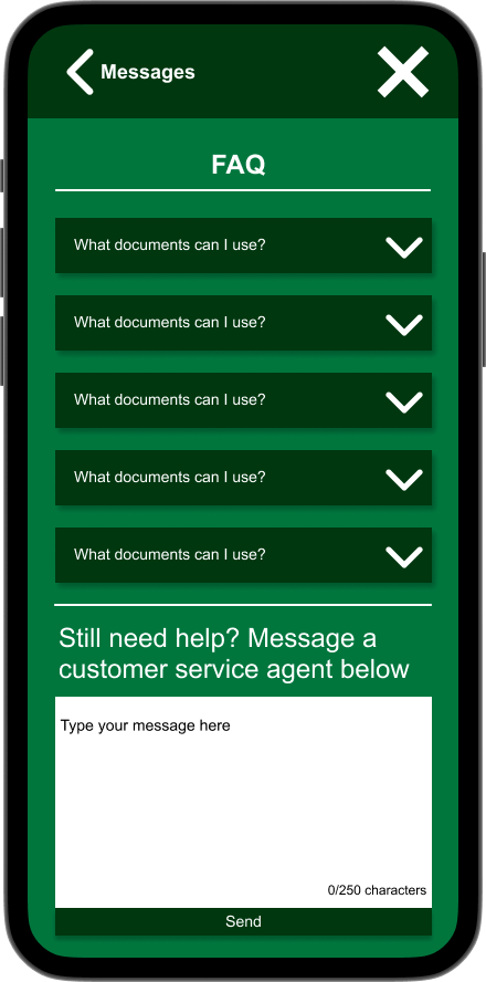
David Molloy

Bespoke Messaging App Design

The Task

The task for this project was to design a bespoke messaging system that allowed users to contact customer support and view FAQs, it was also important that the design was completed in such a way that allowed for it to be easily changed to fit different branding as the system this would be attached to is used across multiple companies.

The Requirements

The requirements of this project were straightforward, below is a list of them.

The Process


Due to the stricter operating bounds of this project a slightly different approach was taken to develop a solution, because of the list of requirements provided by the client the first step was to analyze these requirements and define some key design choices and features that would suit a system like this, from there I began to wireframe out some ideas using these features to create quick concept layouts and then move onto high-fidelity mock-ups which were prototyped out with multiple colour schemes and tested with users to see if the solution worked.

A diagram showing the 4 stages in the project process
The process steps followed during this project

Define

The define stage allowed me to quickly ideate some thoughts for key features and design choices that would help meet the requirements set out, one of these included how was I going to make the messaging feature accessible across any point in the site, intially I thought about an extra link in the navigation pane that would open a new window, but decided this wouldn't work on mobile to well, and that is how the icon/widget idea was decided upon. This also helps with user familiarity as a "chat bubble" is widely recognised.

A scan of a page showing a first basic wireframe for the project, the important feature here is the new messages link in the navigation pane
Images showing the first and second iterations of the wireframes created for the messaging widget

Wireframing

As there was already a layout of the current system provided by the client the first stage of wireframing was to sketch this out, from there following on with the widget-type system I wanted to implement, I produced some wireframes for how this widget would look when it was in use and the different stages that a user would come across during normal usage. Using this widget style of design, there were going to be three main screens that the user would see, the FAQ and new message section, the current/past messages page, and the inner message page for when you are talking with support.

A scan of a page showing a first version wireframe, showcasing the three main screens a user would see A scan of a page showing a second version wireframe, showcasing the three main screens a user would see
Images showing the first and second iterations of the wireframes created for the messaging widget

High Fidelity Mock-ups

Another key requirement was to have the website supported across devices and having already produced wireframes in a mobile format for initial research, the design phase could move straight into high-fidelity mockup making, this started with producing a style guide to follow, showcasing key colours & fonts, then following into mocking up the mobile versions and expanding them into the desktop versions. The current website that sells this candle doesn’t have much in terms of feel or brand so near complete freedom was taken with this.

Screenshot of the final desktop mockup, showing the new messages widget open, on the default page with the FAQ list visible
Final Desktop High-Fidelity Mock-up
Screenshot of the messaging system open on a mobile device size, showcasing what it looks like inside a message with somebody
Final Mobile view of the new messaging system

User Testing

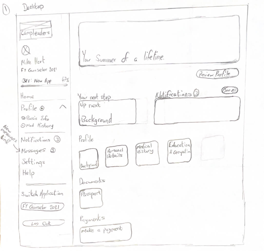
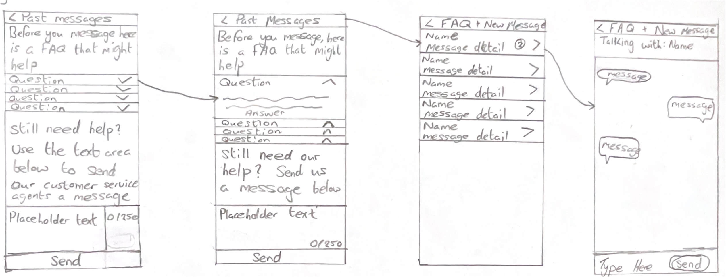
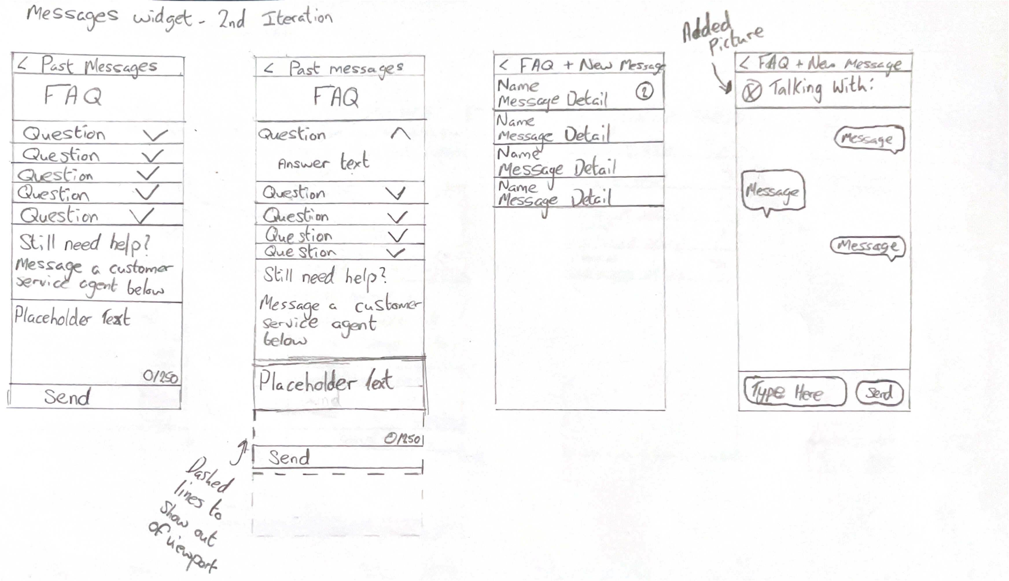
For testing, I ran some small scale think aloud, task-based testing with 7 users, where the user was asked to complete some predetermined tasks and talk the way through their flow and thoughts as they were doing it, for fairness, each user was given the same tasks and information before they began. This testing was able to reveal that what I had designed, was good and all users found it usable. Every user that carried out tasks, was able to complete them, and not everyone used a predicted flow, however the main pain point encountered by users was struggling to access the messages section of the design, so new iterations of this project could look into more research for how users would like this be designed better in the future.

Below is a sample of the questions asked during the testing;

  • Open the chat app/section
  • View the answer to the 5th FAQ question
  • Access the unread message from "Diane Morrison"
  • Find where you would start a new message
A phone mockup showing a previous messages page, with 5 message blocks, one of which is unread from Diane Morrison
The messages page that users would've seen during the testing

The Solution

Ultimately I was able to design a messaging system that works for all, the requirements set out were achieved, such as a system that can suit multiple colour schemes and being able to access the system from any point in the site or during the application process. User testing also backs this up, with user testing showing that the design works for them, being able to accomplish the most common tasks that any user would need to do. Below are three mockups to give a representation of how the final solution will look and feel across multiple device sizes.

A phone model showing the screenshot of the mockup on it A phone model showing the screenshot of the mockup on it A phone model showing the screenshot of the mockup on it