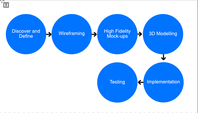
David Molloy

Final Year Project - F1 Website Redesign

The Task

The main aim for this project, was to redesign and develop a site with the acknowledgement that todays web is becoming very boring and similar across all websites. Doing this it was important to keep the overall usability and user experience in mind as in the end it had to make sense to actually use. The main focus I undertook was to include the use of 3D models to increase user engagement.

The Requirements

Below is a set of objectifiable requirements for the project, compiled from user research through a questionnaire, focusing on pain points on the current site and from the project brief. Requirements were also gathered from the brief

The Process


This project followed an agile method through one sprint using the "double diamond" process from the British Design Council, throughout. The first stage involved discovering and gaining insight into the problem, this was obtained through the project brief and the user questionnaire

The define stage is about understanding how the user needs and the problem align and this was used to finalize the list of requirements. In this stage I conducted some desk research looking at and reviewing the current F1 website as well as using a questionnaire to recieve feedback from users, ultimately allowing me to define the user requirements.

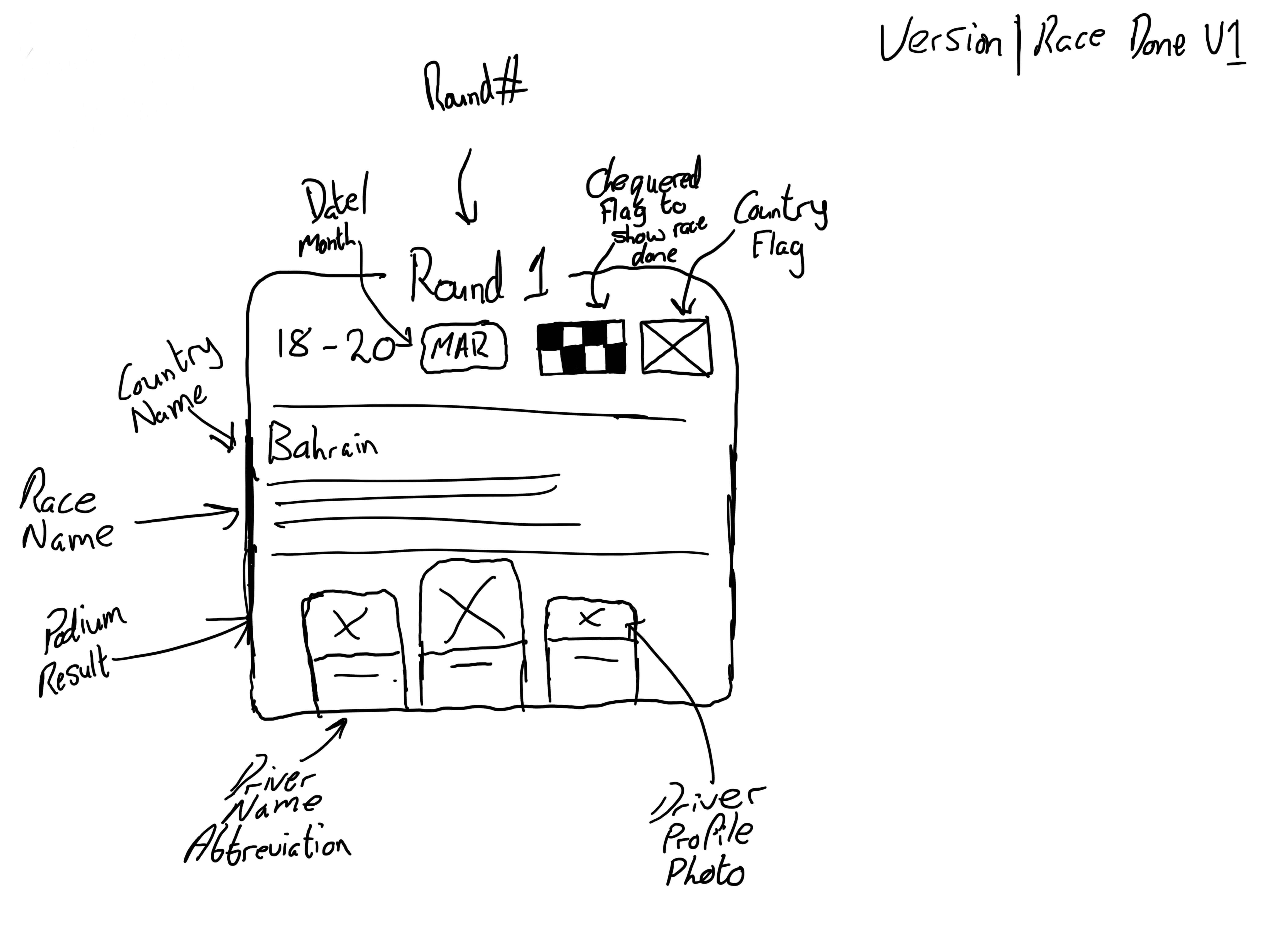
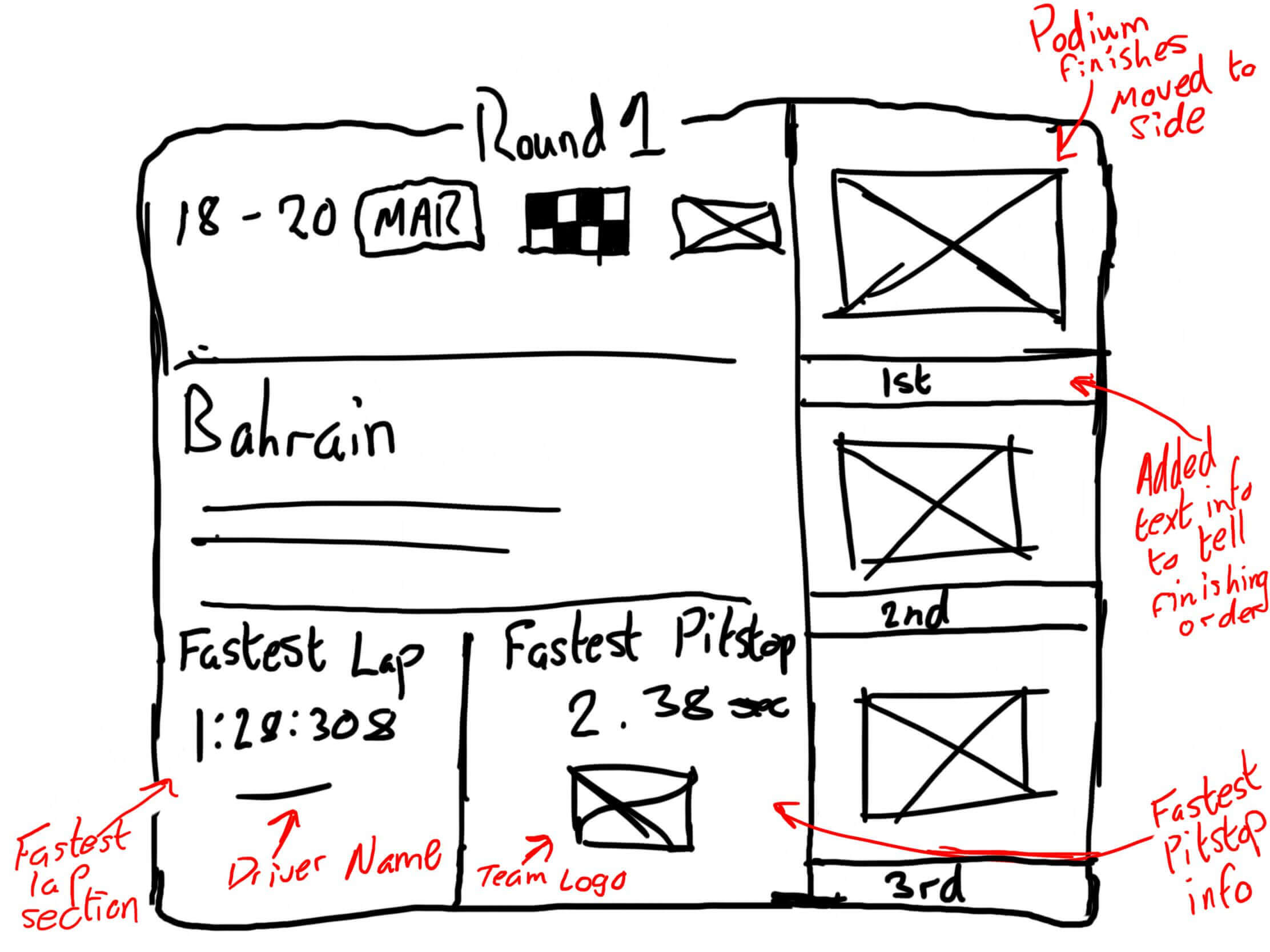
The wireframing stage allowed me to complete quick sketches of ideas and different concepts for the layouts I was working on. This is good because without the limiation of focusing on small details like colour and specific sizing of elements, I could iterate my designs quickly until I was happy with one.

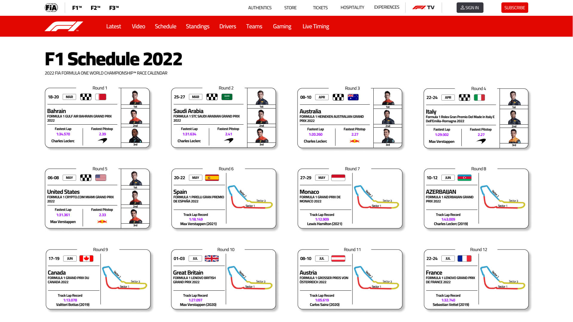
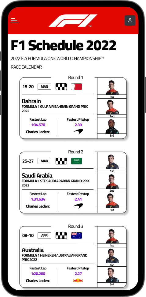
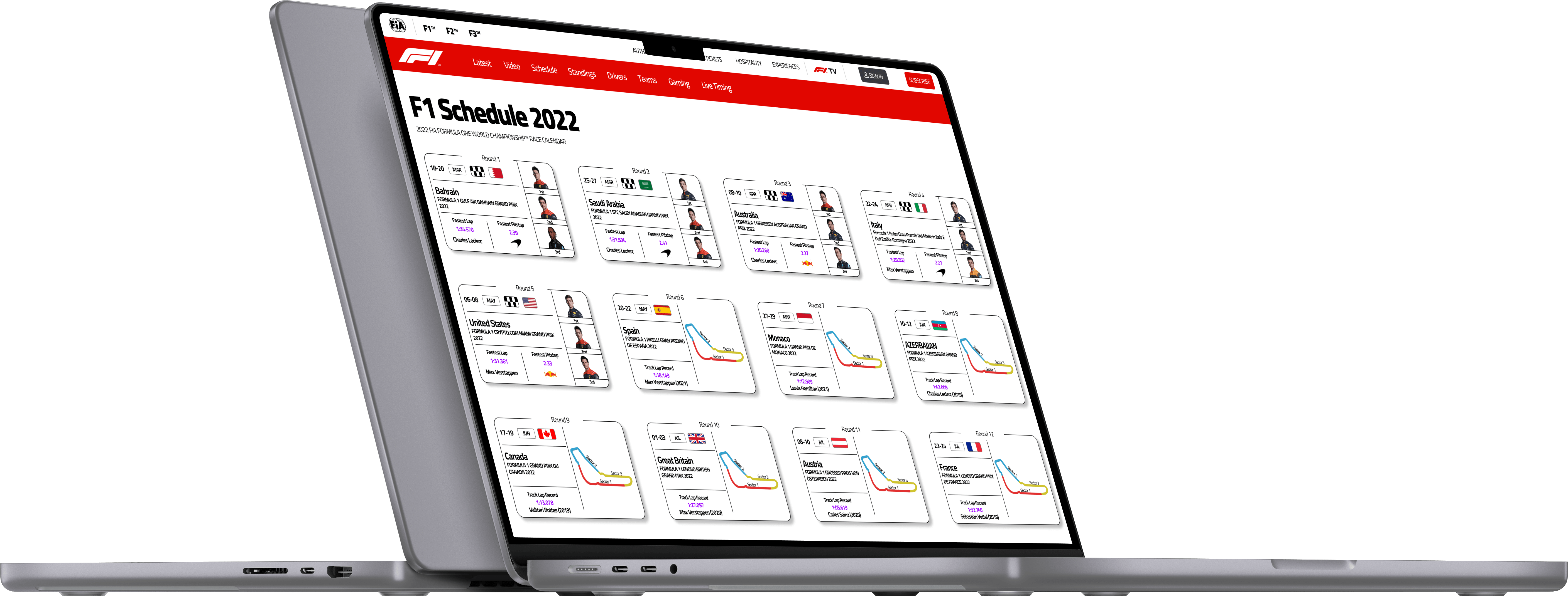
Producing High-Fidelity mockups from the wireframes is the next step, this allowed me to get colours in and specific details included, giving the design a much more full and finished look. If there were any major issues with the layout sketched out from the previous stage, I would likely be able to see these at this point, for example if it just wouldn't be possible to arrange the layout how I wanted due to required element sizes.

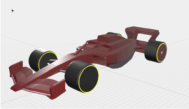
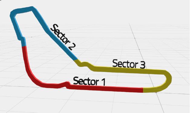
3D modelling is quite a big part of this project, as this is where a lot of the interactivity and new feel comes in, models for cars and tracks would be produced to be used across the website.

Implementation involves coding out the designs that had been produced in semantic HTML, CSS and Javascript, ensuring that the accessibility is kept in mind throughout, including alt tags on all images etc.

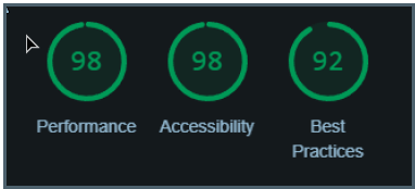
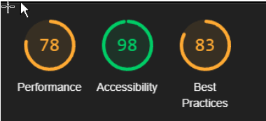
To test the website, two forms of testing are used, first is Google Lighthouse, a tool built into chromium based browsers, that provides a report and summary of performance and accessibility among other metrics. The second testing is user testing, where users provide comparative feedback on my redesign compared to the original website.

A diagram showing the 6 stages in the project process
The process steps followed during this project

Discover and Define

The discover phase consisted of a user survey and some analysis of the current F1 website design. The questionnaire was designed with the sole purpose of finding out problems that users currently have with the website, some of this was focused on the design and implementation of the "Round" cards used to showcase each race in the season, with this 9/10 users asked rated it 3/5 or below when asked about their opinion on the current design. This indicated that it for the users it is quite a problem and could be improved, with this I looked into this area on the current website, with the brief requirements in mind, with it being pretty simple, having the dates, country, name and either 2D track map or the podium finishers if the race had been completed.

The define stage allowed piece together user needs and pain points with the problem that this project set out to solve, take the round card for example, the user clearly has problems wit the current design so it would be reasonable to decide that this is an area that could be made less "boring" with some interactive 3D elements and better design.

Wireframing

To begin my design process, I sketched some redesigns for the "round" card that had been identified from the research to be a problem. I initially began with trying to tidy and clean the original design for my first iteration, making use of some of the whitespace left in the design to move elements around to create space else where. Moving through some more iterations I came to my final one, which has taken more of a complete overhaul of the current design, whilst keeping its original feel and DNA. I moved the podium finishers (or if the race is yet to take place implemented a 3D model of the track map) to the right and stacked them, this makes it easier to quickly tell the finishing order. Moving this to the side allowed me to add some new information to the card such as the fastest lap and fastest pitstop, which were previously hidden within the round page. These changes were able to make use of some of the wasted space to include new data, but without making it feel cramped or overwhelming the user, with too much information or change from the original design.

A sketch of the round card design, showing the round number, podium finishers, country held etc
The first iteration wireframe for the round card redesign
A second sketch of the round card design with the podium finishers moved from the bottom to the right and new information such as fastest lap and fastest pitstop added
The third and final iteration wireframe for the round card redesign

High Fidelity Mock-ups

Using the wireframes produced, the next step was to make high-fidelity mockups of these in Figma, allowing me to get more of the details implemented into the design, such as specific sizes and colours of elements. Whilst producing these, I made a style guide to go along with it, ensuring that the same colours, sizes and fonts were used across the project, as well as making future work easier.

Part of my high-fidelity prototyping also included prototyping a change to the navbar, where the current design uses static images to show each team, I would implement 3D models of each car into this area.

Screenshot of the scheudule page mockup, showing a three rows of four round cards spaced equally
Final Desktop High-Fidelity Mock-up
Screenshot of the mobile schedule page, showing round cards stacked on top of each other
Schedule Page Mobile Design

3D Modelling

For this project, I knew I wanted to produce 3D models for the cars and the tracks where possible, I knew that at least to begin with these would be relatively low poly and quality as this was just for the proof of concept to show the idea could work. As my 3D modelling skills were fairly limited at the beginning of this, I followed some tutorials to grasp the basics of Blender, and a tutorial was loosely used to produce the car model. Following this tutorial I was able to produce a 3D model of an F1 car based on the 2022 regulations and I could save multiple versions of this car with different colours applied for the 10 different teams.

To model the tacks, I used a the current flat images to get the layout and used cuboids to model along the road surface. I made sure to colour each sector differently to show these clearly and also included some text to show what these sectors were for new users.

A screenshot from inside blender showing the final model of one of the F1 cars
A screenshot from in blender showing the final car model produced
A screenshot from in blender showing the model for the Monza race track

Implementation

The original plan to implement the 3D models was to use Three.js, which finds its main use case in implementing 3D scenes into the browser. However after some testing with this, I came across some issues with implementing multiple canvas' which I believed was the best way to implement the 3D models. Having these issues, I discovered the "" library component, which is an open-source project, led by Google. This allowed me to achieve the simple implementation I was looking for as it applied straight onto vanilla HTML/CSS and could effectively be placed anywhere on the page multiple times without interfering with each other.

Testing

The first stage in testing was to use Google lighthouse to monitor performance and accessibility as it was a concern that implementing a variety of models on one page could cause issues with these areas. On desktop I found that the performance and accessibility were still almost perfect, on mobile the performance dropped but not substantially.

I also did some user testing where I asked five users to use the website and provide comparative feedback to the current live design. Five users were selected as this is what the Nielsen Norman Group suggests is the ideal number because as you increase the users past this amount, the amount of issues they find doesn't grow as much. Most of the feedback received, suggested that overall the design changes had made a positive difference, notably, the design of the round card had improved substantially and the extra information was welcomed by all, however, a majority of the users still rated the overall design for the schedule page the same as before. All 5 users also liked the implementation of the 3D models, however, noted they were a bit too small and plain in their current design.

Below is a list of some of the key issues the testing revealed and what would be worked on during the next sprit of this design process.

  • Team dropdown 3D models being too small
  • The schedule page overall design being improved
  • Improvement to the loading on older/slower devices and mobiles
  • Improved design of 3D models
A screenshot of the google lighthouse test report results for the desktop website
Lighthouse report for the desktop version of the website
A screenshot of the google lighthouse test report results for the mobile website
Lighthouse report for the mobile version of the website

The Solution

The aim of this project was to design and develop a useable site with 3D models implemented, that can showcase what could be done when you challenge conventional standards aren't followed. Looking back to the requirements, I could argue this project has been successful in showing the proof of concept works, unfortunately I was unable to meet every requirement, running out of time to properly tackle the standings page, past initial ideas and the performance on mobile while not substantially worse than desktop, it was still worse. However the rest of the requirements and the aim was met, defining this project as black and white success or failure at this point isn't possible in my opinion, but it cannot be argued the potential for success is definitely there.

A desktop model showing the schedule page on a laptop A phone model showing the screenshot of the mockup on it